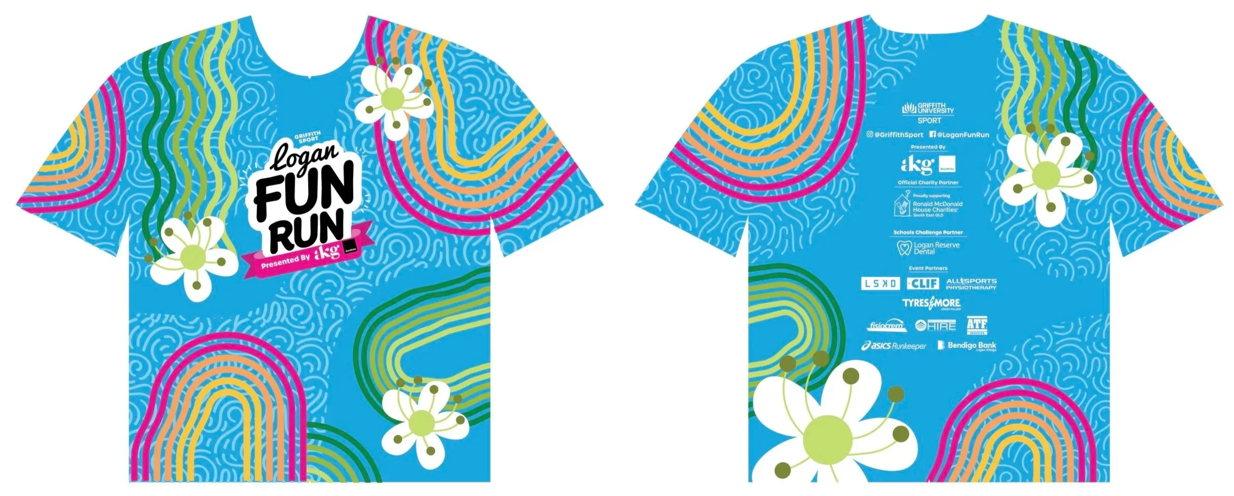
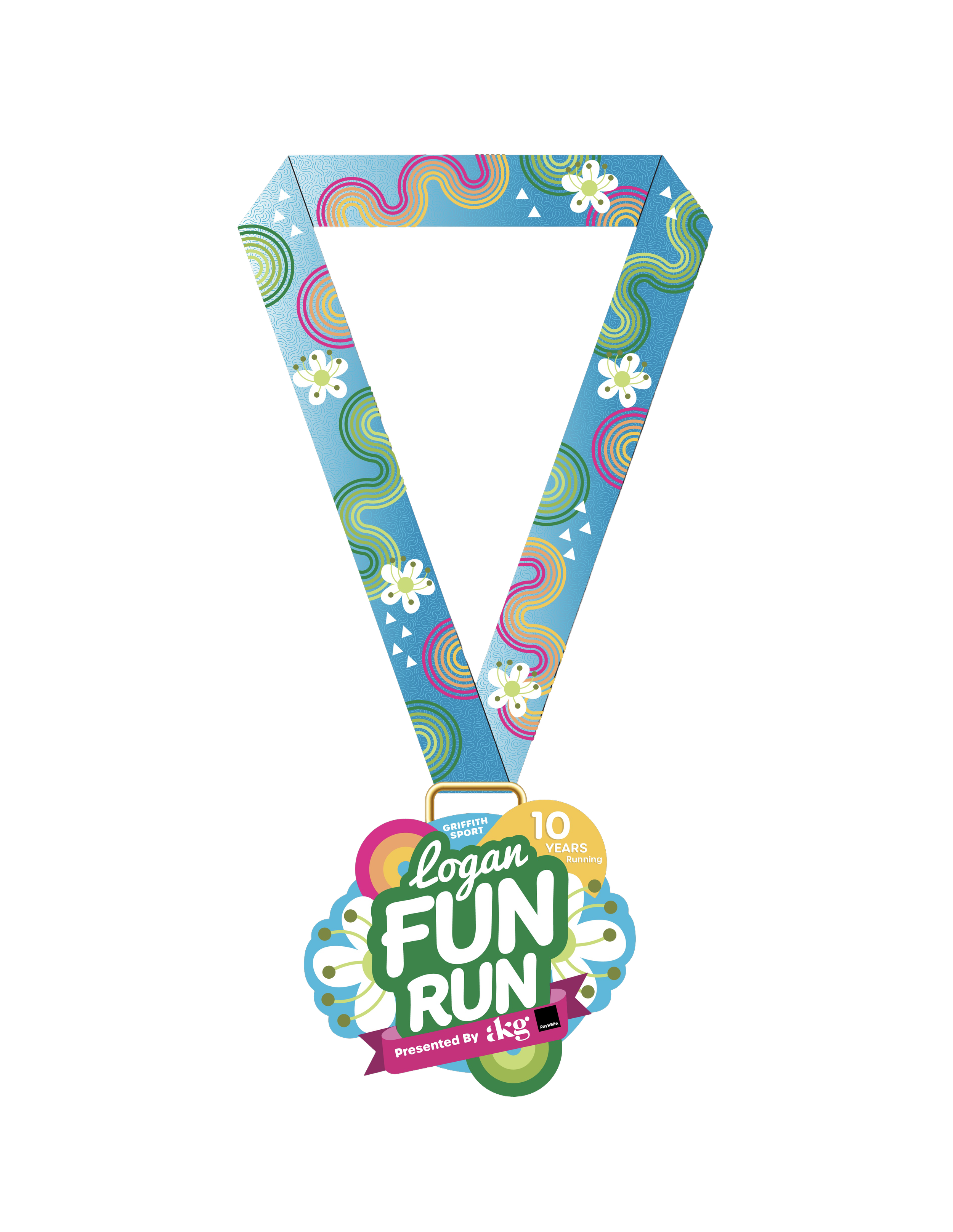
Logan Fun Run MARKETING Concept
The Brief
The Logan Fun was a client of the graphic design studio Liveworm. The goal was to come up with series of deliverables to represent the Logan Fun Run. The client wanted the graphics to include some of the local flora and fauna, whilst also being gender neutral and abiding by the chosen colour palette.
The Process
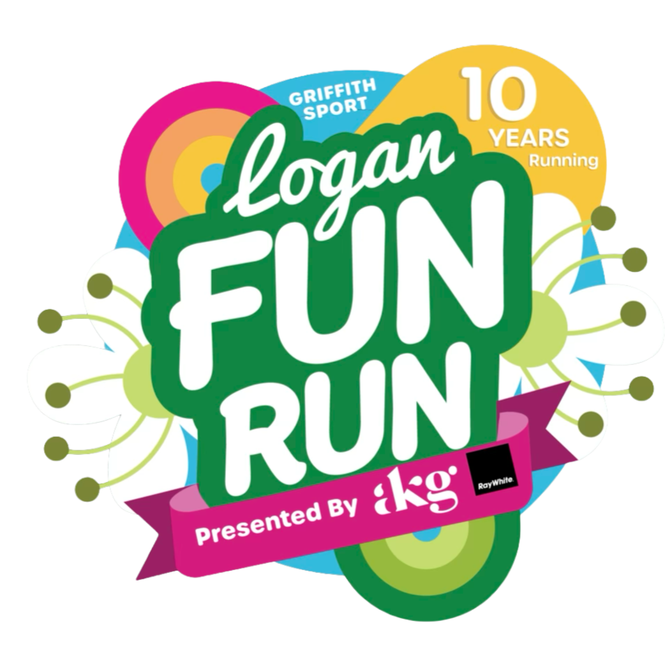
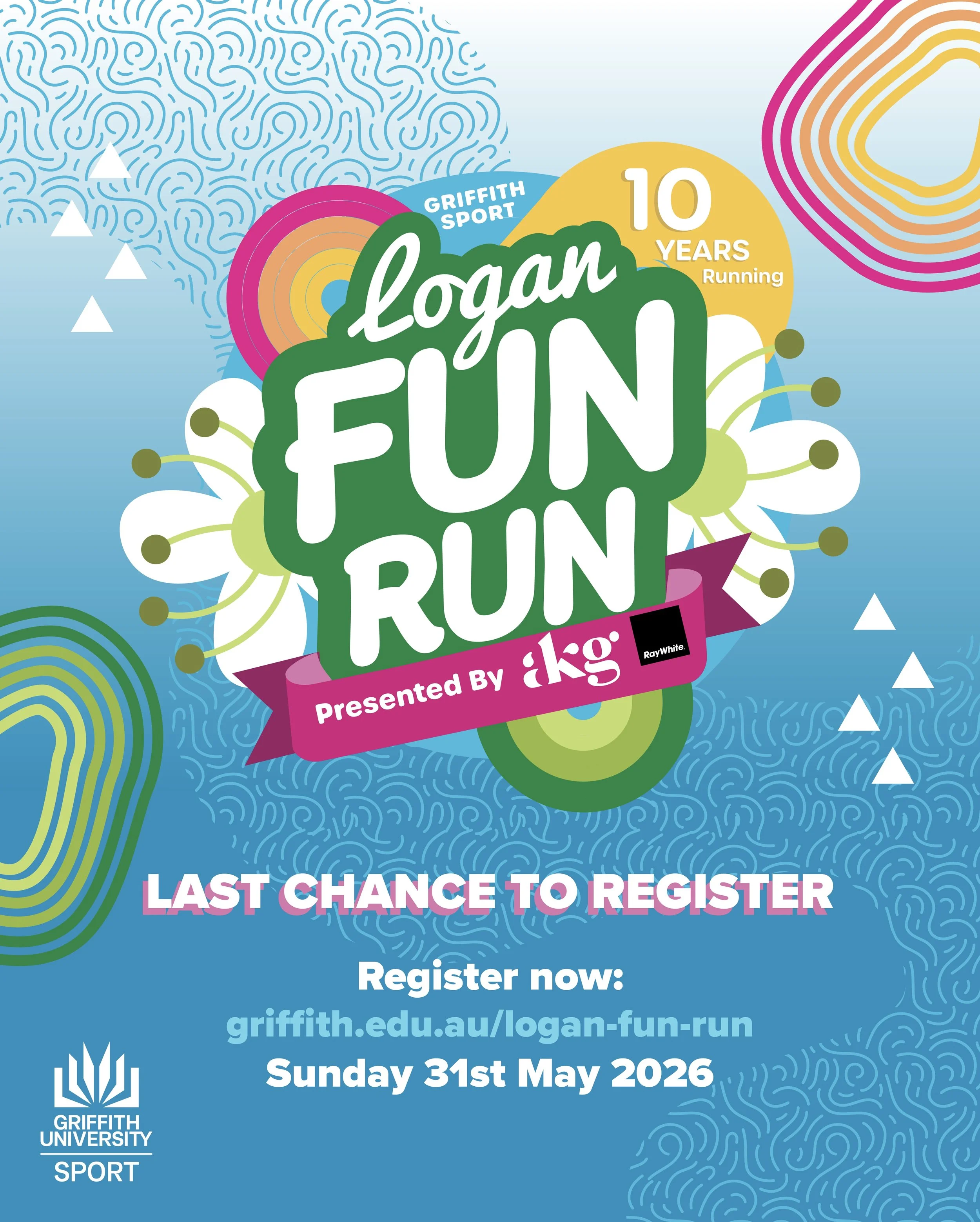
I chose to use the native flora from the Gold Coast area which inspired the flower graphics utilised across the designs. This repeated motif ties all the pieces together and reinforces the values of the Logan Fun Run regarding their ties to the community and the environment. This process included back and forth feedback between myself and other peers in the studio as well as feedback from the client when it got chosen as one of the final 2 competitors for the design.
The solution
The result was a bright, colourful and eye catching set of designs including an instagram post, logo, shirt and medal - that reflects the theme and values of the Logan Fun Run.